Monday, February 27, 2012

Week 7- Special Edition


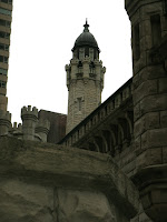
 I wasn't really technically in class this week (it wouldn't hurt to send out an email reminding the class we're not meeting in the classroom!)  Monday I was late so I went downtown and took pictures since I had no other classses, and downtown is halfway to school. I was clearly near water tower. I like the area, there are a lot of old people that live around there actually if you go into the side streets, makes it a nice walking zone.

Craft:
I used my GE A1255 12.2 mp camera, and edited a bit using Iphoto adjustments. I tried to frame the subjects in the middle of the shots, and I used different settings on the camera such as flash, zoom, portrait, and cloudy settings. all of the objects are found, there were no creative arrangements.

Concept:
I wanted to capture photos and had the "fire" theme in my head still. The wall and the tower on top are art of the water tower area in the near north Chicago, which lasted through the big crazy destructive Chicago fire. I guess I'm showing the resiliency of my city. The bottom left photo was taken on an L platform near my home and it just looked desolate, my concept was to capture it in the most interesting way possible, which ended up being at this angle looking down over it, but not beyond it. The cone is definitely in focus first on purpose. I also want you to see the dirt. It's grimy, it's been used, it is forgotten there. The bottom right photo was taken at the fire house just down the road from the water tower. I really wanted a good shot of their door, but the trees over there were constantly in the way no matter where I angled the camera from. I thought this one was a little ironic because it reads FIRE but this photo is rather serene to me. there are nice rows and lines, there just one bold color, it's orderly while warning about disorder.

Composition:
For the most part I focused on centering these objects in the pictures and kept with the natural straight lines, which tend to go in at a little angle. The top right photo of the tower plays with layers and position since there are a lot of things physically in front of the main tower, but I think I accomplished making the viewer see the tower back there first (maybe only second to the bright cloudy sky). The bottom two use the power pop of color to draw the eye to them. 

Monday, February 20, 2012

Special Edition- Midterm AIC

Art Institute
Proof I was there, a pic of Nate

Chosen Masterpiece
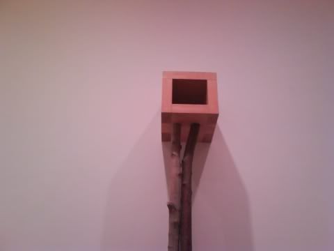
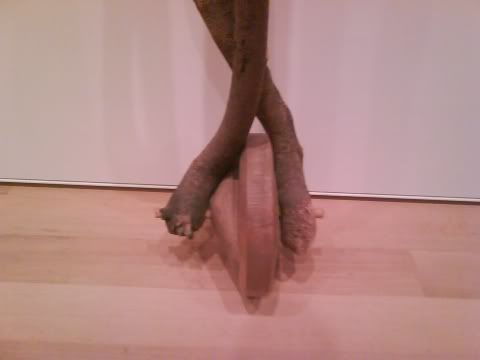
    by Martin Puryear (1982)
Sanctuary
Using: Pine, Maple, & Cherry


Why I like it: I'll admit, lately i've been very into contemporary art. 5 years a go I didn't get get any of it, now I do and I love it. I liked this piece because of the possibilities that came to mind when I thought about it. It made me think! To me a master of his art can create something that is inspiring and thought-provoking.

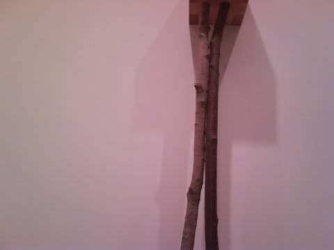
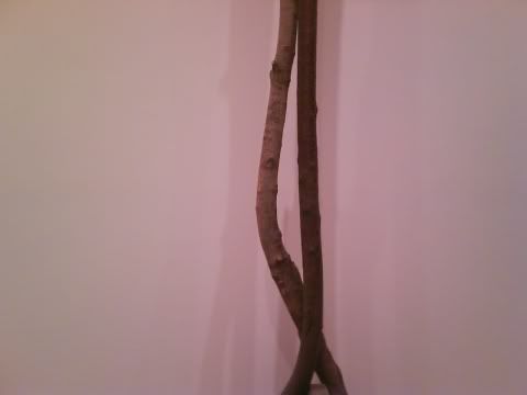
Craft: It's made using just wood, different kinds of wood. a few boards were put together to create the cube on top, and longer limbs are placed as the legs, with a rounded piece as the base.

Concept: The title lends itself to what I think the artist meant with this piece. By Sanctuary it is very tall, it is secluded, it is empty, it is uncorrupted by inorganic materials, It is free standing. It reminds me of a birdhouse and a unicycle. It looks like a tall gangly awkward person relaxing as the wallflower at a party. It is open to interpretation, even with the title it can mean so many things.

Composition: Wow. So this is arranged, kind of bottom up. At the base, there is a lopsided wheel shape, the center acting like an axle. There are 2 unconnected "legs" which cross paths and that seemingly support each other. They are not smooth, they have natural lumps and grooves which give them a bumpy texture. directly above is a cube shaped box, with an opening away from the wall. Nothing is inside this box. I see no evidence of paint on the piece. I notice looking up that underneath the corners are darker, many different pieces of wood have been used to create the cube, not just a big carved out hunk or 4 simple sides.

Week 6- photo shoot

Inspired by: http://bulk.destructoid.com/ul/198194-/poster-super-620x.jpg


This is chosen as the best photo, mostly because the pose is most like the attributes that I need to make a similar movie poster.

Craft: Not Photo Not Blurry
This photo is very in focus. There were one or two that I had experimented with having the camera closer and zoomed in, but some of those did not have the crispness that I was looking for. My model is pretty well framed for a bust shot (the extra head room will not effect the outcome of the final piece). I used a green background because she is wearing a white shirt and black bandanna. She looks sort of blank which is completely on purpose. I did not explicitly need props, though I will be making a few to scan most likely.

Concept: Communication of poster information
The poster is going to be a remake of the movie Super's poster. Rainn Wilson is looking ahead, with his right eye slightly looking right. his lips are closed, not smiling or frowning. His eyebrows are down indicating he is a little flustered, maybe worried or sad. I think her face is very similar to this. The lighting is pretty direct, just a bit of shadow on the right left side. Her pose is just sitting in a chair facing the camera. Her face IS the prop.

Composition: Accurate Reproduction
The only two things that could have made this more accurate would be if my model was male and if he had blue eyes. Lucky the composition of the intended piece is distorted enough that a girl as model won't matter and I'm very capable of turning her eyes blue. In the actual photo, it's a strong bust shot, well centered and there is plenty of head and lead room. There isn't a lot of Boise either. She is looking with her eyes correctly and her mouth is blank as it should be.

Week 5- Adjustments (Transformation)


Craft: These were the collages that were printed this weekish. The top right collage features a darkened object nearly in the center. I did this using the adjustments tools. The middle collage features many many repeated images that together form triangular shapes, even though the actual shape of the object is more or less round. I copy and pasted each layer and row then used the tool to move the image around until it was arranged like this. The third image is similar to the first where it was just moving the image ad copy/pasting it until it was arranged how I wanted it, except I also flipped the image at 2 points where it does not go with the natural flow, and these 2 parts are also slightly larger than the rest.


Concept: Our overall concept so far has been fire, to communicate that this is fire and this is what it is. The top right image looks almost like a shiny red button, that bright red color that screams emergency to me! The middle image has a clearly hot blue flame, it's blazing and communicating fire through the harsh reality that fire spreads insanely easily and fast, it can cover every inch in seconds. The third image is communicating that fire is twisted. It's got many purpose, like cooking, light, heat... It's got passion and this one is communicating that it can life can either consume you or it can provide you with valuable resources.

Composition: The top left is an image of a fire alarm, using only the top bell part of it. They are arranged kind of to look like push pins, with one popping out just a little bit, and the color popping a bit more. The rows are almost linear, but a little in disarray! The middle image is using a gas burner/stove top and it reminds me of an Escher tessellation because it just keeps going and going and going. The triangles really set this one apart. The last one to the right is using a candle. it's more abstract, and presents itself with wavy lines.

I made several variations

Craft:
Using the images that have been cut out, make collages using a single item per collage. To create these, I used the already cut out photos from week 4, and arranged several of them into different patterns. I used images of lighters, a stove burner, and a candle. I made 5 of these, with 3 variations on the stove burner, and one of the other two. I arranged the images lineally, stacking rows on top of one another. I grouped several copies of the image together to create static rows that could all be moved in formation together. The last stove burner was my favorite collage, pictured to the top right. It appears to have triangles because of the position of the burner pieces in relation to one-another. I moved the pieces around a lot to get this effect.
Concept:
the concept was to use Photoshop layers effectively. The images were specifically arranged in each of these collages and the effect of repetition and overlapping gives a wow factor to what is being showed off. In this case a burner, a candle, and BBQ lighters. A statement about what these things are and how they are used is what I'm construing.
 Composition:
lines, repeating images, shapes. The burners clearly have a triangular pattern, the candles have a wavy feel to them. many of the layers are joined together into easy to move rows. they have the same image and the same color and there isn't just one resting place for my eyes.