Tuesday, April 17, 2012

Week 15- first 10 images


Monday April 9th, Week 14

This week we thought about what we would be doing for the final project.
I came up with a storyline about a girl reading a book who is then sucked into the book and must choose either to follow a dragon or a beaver.
if she follows the dragon, she will choose either to go to a castle or into a cave to help him find his lost wings.
If she follows the beaver, she will help him fix his broken dam by searching for sticks either in the dark woods or up the steep hill.

Monday, April 2, 2012

Week 13- how to...colored in


http://www.sxuhero.com/vc2s12/lbr/ <--- go here to see project on the website

week 12- How To Fist Pump


This is my illustration of how to fist pump (like a boss).

Craft:
I wrote a list, then I created small images to illustrate the list in pencil, then I drew all 9 images larger on individual pieces of paper first with pencil then over with pen. Then I scanned each image into the computer and created jpegs.

Concept:
My concept is how to fist pump. You should be cool, watch Jersey Shore/ dumb Reality TV, look at your hands, curl fingers in, flip your hands over, practice by throwing a single fist into the air, bring the fist back down, throw both fists into the air at the same time, and bring them back down. I thought it was a  fun things to do in 9 steps. I wanted to show that it really is as lame as it looks.

Composition:
I generally centered the images, it's very cartoony and I used a lot of thick fill-in-able area made with connecting lines. There are many arrows to show direction. all of the images are in a specific order.

Week 11- how to scan (9 steps)


1. make a 9 step list
2. separate a sheet of paper into 9 steps
3. draw these 9 steps with a pencil
4. draw over the pencil with pen
5. connect a scanner to a computer and scan the 9 steps and the list
6. draw the 9 steps larger on 9 separate pieces of paper with a pencil
7. go over all nine drawings with a pen
8. scan all 9 images individually to the computer
9. save the images onto your flash drive.

Monday, March 19, 2012

Week 10- How to In 9 Steps


Craft:
I drew this 9-step how to illustration with pencil, then scanned it into Photoshop. To scan, I plugged the scanner into the appropriate computer. then made sure the program came up in photoshop. I placed the image face down under the lid of the scanner with the page fully against the top right corner. Then I went into photoshop to image then import and found the name of the scanner there. A new window opened with options. I chose a 300 resolution and 24-bit color. I hit the preview button to make sure that I was scanning the correct image. After checking that the image was correct and how I wanted it, I scanned the photo directly into photoshop. 

Concept:
The concept was to make a 9 step illustration. My idea was how to blow your nose. I wanted to convey how to blow your nose into the tissue so that boogers would not escape.

Composition:
I used one character throughout the illustration, and took the viewer through the process visually. I also drew a box of tissues, where I used one of two words used in the illustration, kleenex, to make sure that it was properly communicated that this was a tissue box. I used symbols like an arrow to show the person to pull the tissue up out of the box, and a crossed out circle to show how not to open the tissue. I used lines to show the force of blowing into the tissue, but also included the word blow, the second word used in my illustration. I used circling arrows to show that step seven (blowing) should be repeated before you toss out the tissue.

Monday, March 12, 2012

week 9- Movie Poster corrections


Craft:
To make this image, I used Photoshop. I took a picture of a girl using a fancy camera that SXU owns in front of a white screen. I cut out her eyes and mouth/chin in the shapes I needed . I added a drop shadow. I painted on a white highlight using the bush tool. I made the shape of the chat balloon based on the shape in the original poster. I used fonts that were somewhat similar, though I could not 100% recreate that. The background has a plain red layer and then a high opacity layer with some white strokes that I then used blur on. I changed the girls eye color from brown to blue. I added shadow with another opaque layer on her face. Also used some burn tool and dodge tool to make spots darker and some spots lighter.

Concept:

Composition:


Week 8- Movie Poster update (March 5th)


Monday, February 27, 2012

Week 7- Special Edition


 I wasn't really technically in class this week (it wouldn't hurt to send out an email reminding the class we're not meeting in the classroom!)  Monday I was late so I went downtown and took pictures since I had no other classses, and downtown is halfway to school. I was clearly near water tower. I like the area, there are a lot of old people that live around there actually if you go into the side streets, makes it a nice walking zone.

Craft:
I used my GE A1255 12.2 mp camera, and edited a bit using Iphoto adjustments. I tried to frame the subjects in the middle of the shots, and I used different settings on the camera such as flash, zoom, portrait, and cloudy settings. all of the objects are found, there were no creative arrangements.

Concept:
I wanted to capture photos and had the "fire" theme in my head still. The wall and the tower on top are art of the water tower area in the near north Chicago, which lasted through the big crazy destructive Chicago fire. I guess I'm showing the resiliency of my city. The bottom left photo was taken on an L platform near my home and it just looked desolate, my concept was to capture it in the most interesting way possible, which ended up being at this angle looking down over it, but not beyond it. The cone is definitely in focus first on purpose. I also want you to see the dirt. It's grimy, it's been used, it is forgotten there. The bottom right photo was taken at the fire house just down the road from the water tower. I really wanted a good shot of their door, but the trees over there were constantly in the way no matter where I angled the camera from. I thought this one was a little ironic because it reads FIRE but this photo is rather serene to me. there are nice rows and lines, there just one bold color, it's orderly while warning about disorder.

Composition:
For the most part I focused on centering these objects in the pictures and kept with the natural straight lines, which tend to go in at a little angle. The top right photo of the tower plays with layers and position since there are a lot of things physically in front of the main tower, but I think I accomplished making the viewer see the tower back there first (maybe only second to the bright cloudy sky). The bottom two use the power pop of color to draw the eye to them. 

Monday, February 20, 2012

Special Edition- Midterm AIC

Art Institute
Proof I was there, a pic of Nate

Chosen Masterpiece
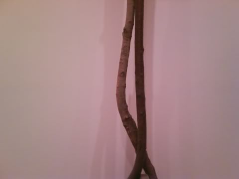
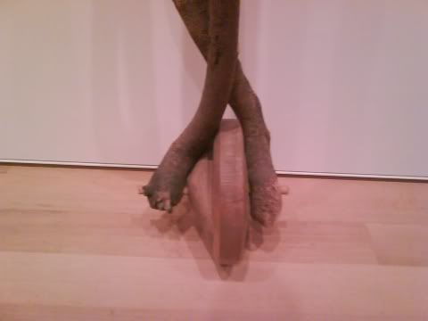
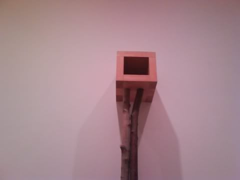
    by Martin Puryear (1982)
Sanctuary
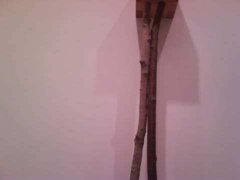
Using: Pine, Maple, & Cherry


Why I like it: I'll admit, lately i've been very into contemporary art. 5 years a go I didn't get get any of it, now I do and I love it. I liked this piece because of the possibilities that came to mind when I thought about it. It made me think! To me a master of his art can create something that is inspiring and thought-provoking.

Craft: It's made using just wood, different kinds of wood. a few boards were put together to create the cube on top, and longer limbs are placed as the legs, with a rounded piece as the base.

Concept: The title lends itself to what I think the artist meant with this piece. By Sanctuary it is very tall, it is secluded, it is empty, it is uncorrupted by inorganic materials, It is free standing. It reminds me of a birdhouse and a unicycle. It looks like a tall gangly awkward person relaxing as the wallflower at a party. It is open to interpretation, even with the title it can mean so many things.

Composition: Wow. So this is arranged, kind of bottom up. At the base, there is a lopsided wheel shape, the center acting like an axle. There are 2 unconnected "legs" which cross paths and that seemingly support each other. They are not smooth, they have natural lumps and grooves which give them a bumpy texture. directly above is a cube shaped box, with an opening away from the wall. Nothing is inside this box. I see no evidence of paint on the piece. I notice looking up that underneath the corners are darker, many different pieces of wood have been used to create the cube, not just a big carved out hunk or 4 simple sides.